Showing posts with label F. Schumacher and Co. Show all posts

7/01/2013

Entry Makeover

Wow...can't believe it's been over a month since I posted. Clearly things have been a bit too hectic for blogging lately. Anyhow, I'm coming up for air now and hope there are a few of you still out there reading despite my vanishing act. I do have lots to report, so stay tuned!

I've been trying to rework some things around my house over the past couple of months and it's definitely been a struggle because I just haven't had spare time to focus on it. Slowly but surely, I'm chipping away at my list and I have glimpses of progress to share. First off, I changed up my entry. Step one of the process was installing wallpaper. I chose Schumacher's Mosaic in silver, which looks white but has a subtle silvery tile-esque pattern...


It feels really light and fresh and is a good change of pace from the dark bluish gray paint that was on the walls before. This shot shows the pattern a bit more closely...


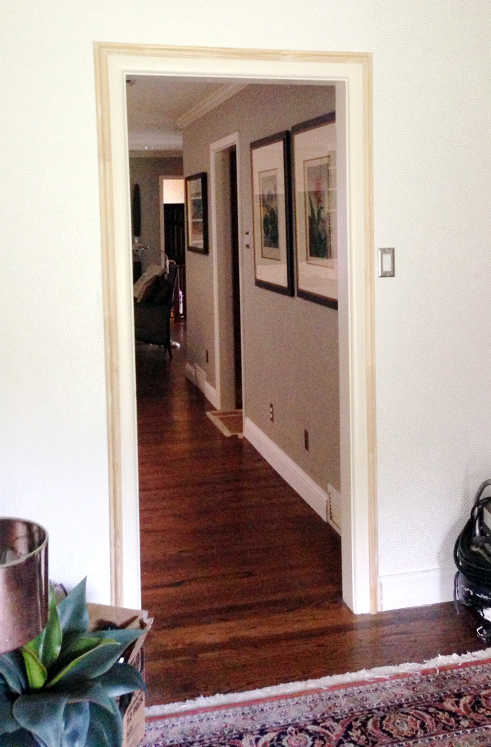
The new wallpaper called for fresh paint on the trim and ceilings...and I took that opportunity to change out the baseboards and beef up the door frame moulding. I'm pretty sure the existing moulding was original to our 1952 home, so it was pretty spartan. I asked my carpenter to layer a trim piece over the old moulding to create more interest. This route meant I could improve the look without ripping out all of the old stuff. Here's a look at the trim before it was primed and painted...

After the walls and trim were dealt with, I sent the main piece of furniture in the space, a commode that belonged to my great great aunt, off to be refinished. I chose an ebony stain with a light wax finish because I wanted to highlight the lines of the antique and its pretty hardware. The original finish was a flat light/medium walnut and it just wasn't doing the gorgeous chest any favors.  After the finish facelift was underway, I selected a Calacatta Danby marble remnant for the top and voila...

Another major change in the room was the rug. I transplanted one from the living room and I'm loving it in the entry. It's amazing how different something can look in new surroundings. It brings just the right amount of color to the area.

In case you never saw it (or don't remember), this is what it all used to look like...

So, the entry is almost finished aside from hanging more artwork and improving the front door situation. Our door is pretty ugly so I either want to get a new one or just change the glass (it's that rippled Flemish glass) and have it lacquered or restained. I'm anxious to get that underway. It's totally one of those things that I've tried to ignore since we moved in four years ago and I think it's officially time to make a move.

So, what do you think of the changes? I'm liking the new vibe...it definitely flows better with the adjoining rooms and it just feels light and airy.

4/13/2012

Lulu DK Child for Schumacher

I'm so pumped that Lulu DK's Child collection for Schumacher is here! Even though it's meant for kiddos, I would totally use some of the prints in more grown-up spaces.


The color palette is really fresh and exuberant and the price point is reasonable. I need to go check out the samples to feel the weight and texture of the fabrics. These are my favorite styles and some ideas on how to use them outside of a child's room:

Jelly Bean is perhaps my favorite...it would make a REALLY cute upholstered headboard. I could also picture it used for pillows in a casual living room.
I'm crazy about this elephant print called Parade. I can picture euro shams made with it and it would also be darling on an accent piece like an upholstered stool. The second fabric here is Skittles and being a small scale print, it's super versatile. It would make a nice bedskirt (with poppy colored trim tape border), shower curtain, or tablecloth.
Ode to Matisse would make fab curtains, Macaroni is ideal for a bolster pillow (with navy cording), and Firecrackers is a great print for upholstery, although I'd need to see/feel the fabric before endorsing it for that purpose.

Lulu DK | Child is quite a mood lifter, don't you think? I love its happy, lighthearted vibe. So many of the prints feel like summer. I definitely find myself wishing that all of the above were indoor/outdoor fabrics so that I could use them by the pool...and really, that would've made sense for a kids collection anyway.

Happy weekend!

1/06/2012

Schumacher's New Crop of Indoor-Outdoor Fabrics

Schumacher recently released a new indoor-outoor collection called Côte d’Azur and it's pretty fab. The set is full of textures and colors that don't scream spring/summer (like Trina Turk's) and the more fall-winter-centric style of the collection is refreshing and very versatile. Here are some images of the fabrics at work...


Tortola, as shown above in Oxford Grey, is a favorite of mine. I like that it's graphic pattern is interesting and impactful but still understated and timeless.

I love this umbrella in the Cannes Awning Stripe (also in Oxford Grey) and while I think the Antibes Chevron looks great on the chairs, I'm not too excited about the fabric because I think that pattern is overplayed at the moment.


Navy is so classic for outdoor spaces and most of the Côte d’Azur fabrics are available in a navy colorway.


The group includes some unconventional textures for outdoor fabrics including velvet, chenille, matelasse, and herringbone. But of course, even though all of the product photos are of exterior spaces, remember to keep the collection in mind for interiors as well. I'm excited to touch and feel them...if they're good, they could easily because some of my new favorite fabrics to use on hard-working, dog and kid friendly upholstery.

Besides the Tortola in the Oxford Grey and all of the colorways of the Cannes Awning Stripe, these are my other favorites from the bunch:
Cap Ferrat Weave in Viridian
Menton Chenille in Pool
Tortola in Marine

Are these idyllic outdoor photos torturing some of you? Here in Texas the weather is nice (for the moment), but I know that most people are suffering through cold winter temps right now. So I'm sorry to dangle warmth and sunshine in front of you! Like I said though, don't shrug these fabrics off if you're planning interior upholstery projects. Too bad Schumacher didn't get a shot of a big cozy sofa covered in the plush Monaco Velvet to keep us all from having season envy.

Have a fantastic weekend!

9/15/2011

Another Guest Bedroom Idea

I'm still tinkering with fabric combos for a guest bedroom in our house. As I mentioned in a previous post, I have a new rug for the room. The rug calls for a new color scheme so I plan to have a headboard and bedskirt made in addition to reupholstering the wing chair in the corner. Curtains will also need to be made. Basically, I'm revamping the whole room!

I was thinking about going with a red as the dominate color so I pulled a few more fabrics in that color family. I'm not sold on the idea though and might go with a navy instead because I like the contrast it provides. Check out the images below and let me know what you think. I'm still on the hunt so anything is possible at this point!

 Here is Schumacher's Ziggurat on the headboard and bedskirt. I've included light blue piping/cording to trim both pieces. I'm afraid this might be too geometric.

A bit more simple, here is a navy headboard from Live.Like.You and a plain navy bedskirt. I'd have to add some trim to the bedskirt to make it a bit more interesting.

Here are the red fabrics that are in the running...I like all of them, but don't think any emit the style that I'm going for. 

Schumacher Maracanda Vine - Berry

Schumacher Charlton Floral Vine - Cherry

Schumacher Villandry Damask Print - Pomengranate
What are your thoughts? Since I'm not in love with any of the above options, I'll continue brainstorming and hopefully the eureka moment will come sooner rather than later!

9/07/2011

The Latest and Greatest from Schumacher

Have you seen Schumacher's new releases? They just debuted their Fall 2011 offerings and there are some fantastic new fabrics, wallpapers, and furnishings. I am LOVING so many of the colorways...very fresh, versatile, and bright!

One of my favorites out of the bunch is Cambay Paisley Print. On the chair it's shown in Sandalwood...

 And on this panel it's shown in Parrot...

The Azure colorway looks pretty too....and I'm sure it's even better in person. As you can see from the above photos, the digital swatch never does the fabric justice!


Martyn Lawrence Bullard's collection is part of the new release and I'm pretty excited about it! Most of the fabrics are rich with vivid colors and lively patterns. The overall color palette is pretty spectacular and it will work for all seasons, which is a major plus.

Shown in this photo are Sinhala Linen PrintSikar Embroidery, and Adras Ikat Print...all in the Jewel colorway... 

 This one, Nebaha Embroidery, is one of my favorites. I think it would look amazing on a wing chair!


Here is Pasha Paisley, a perfect fabric for drapery. I also love the Bittersweet colorway as shown below...


 The Chroma collection also had a few standouts that I'll be keeping on my radar. They include:

Soho Weave (and I just had to highlight my fav colorways, Valencia and Capri)


On the wallpaper front, here are my picks from the Jaipur and Modern Glamour collections:


 Rampura in Turquoise

Chevron Texture in Mineral

Haruki Sisal in Peacock

Shagreen in Chinese Orange

And finally, the Madison Wing Chair is my favorite addition to Schumacher's line of furnishings...