Showing posts with label kitchen. Show all posts

1/16/2013

White + Walnut Kitchen by Gluckstein Home

Not going to lie...I get a bit bored by an all-white kitchen. Despite the fact that white is one of my favorite colors (yes, it counts as a color), to me, there needs to be some sort of contrast or color in the space. When you divert from the all-white playbook, it just gets more interesting and unique.

On the Gluckstein Home Pinterest feed I saw the following kitchen, which perfectly illustrates my point. The bold walnut border accents on the cabinetry make the room look special and dynamic...yet it still is a classic, clean white kitchen. I also think it's a great blend of modern and traditional styles. Anyhow, I wanted to share because it's an out-of-the-box idea for cabinetry and is a great option for those that want a mostly white kitchen...

Photo via Gluckstein Home

Photo via Gluckstein Home

Photo via Gluckstein Home

What do you think? Are you a fan of the all-white kitchen or do you prefer more of a mix of color and materials?

9/20/2011

Cutting-Edge Kitchens by SieMatic

SieMatic's ads keep getting my attention with their gorgeous product photography. The German company showcases exquisite kitchen designs and after seeing those, I went to dig for more on their site.

I will warn you...the SieMatic website is cavernous and you can easily get lost. I waded through lots of super modern, euro kitchens (not my style) with the goal of finding more shots of their newest collection, BeauxArts.02, which is featured in their current ad campaign and is shown here: 


SieMatic has the fresh perspective on kitchen design that I've been craving lately. For the past few years, I've been seeing the same white kitchens over and over again. So when something new and unique like this chrome and glass storage cabinet comes along, I get pretty excited about it.

I like the cooktop area shown here. Seems like a good workspace and the stainless steel cabinetry looks pretty darned cool. 

The following kitchens are from SieMatic's first BeauxArts collection...

I love this handy storage area by the cooktop...such a smart idea!

The furniture-like cabinet unit on the left is so amazing...it's functional and gorgeous. Although, I do wonder how you get into those drawers near the top!

This shot shows off the ridiculously cool two-toned cabinetry that surrounds the range. I'm hard-core obsessed with this look...and I'm also obsessed with the range which looks to be a La Cornue CornuFĂ© 110 (aka my dream range)

During my SieMatic web journey, I fell into a trance in the Interior Accessories section. The photos shown there send OCD peeps like me into a tailspin. Let's put it this way...in SieMatic's Type-A Utopia, there is a place for everything and everything is in its place. One day I will have one of their drawer systems in place...I hope! 


What do you think of the kitchens above? Do you have a favorite? And are you as gaga over the SieMatic drawers systems as I am? I'm sure that there are plenty that think it's organizational overkill!

8/12/2011

The Lovely Work of Carter & Company

Yesterday's journey into the world of Paris Ceramics led me down the path of discovery of Carter & Company, a revered Boston-based interior design firm. Their offices are located on Newbury Street in Back Bay (one of the prettiest neighborhoods EVER) so it's no surprise that their work is timeless, sophisticated, and luxe. 

Based on their impressive portfolio, Carter & Company is capable of executing a wide variety of styles...in their oeuvre you'll find everything from a sleek modern kitchen to a traditional dining room in a historic home. Their design prowess coupled with this versatility is likely what has landed project showcases in major magazines like InStyle, New England Home, and Traditional Home

From their portfolio, these are some of my favorite spaces...

Simple white kitchen with all of the right details (inset cabinets, beveled-edge subway tile, great flooring, etc.) that make it standout from the rest. I'll never get that divine Spanish marble checkerboard floor out of my head!
Photo via Carter & Company

This office is chic and fun. I love the Quadrille Henriot Floral curtains and the crisp white lacquered desk.
Photo via Carter & Company

Classic dining room with just the right amount of drama. The contemporary mirror keeps the look from getting too stately.
Photo via Carter & Company

Perfect little marble-clad bathroom...
Photo via Carter & Company

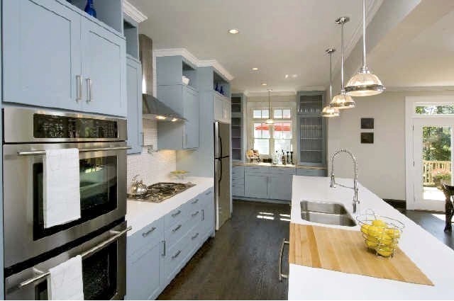
Another great white kitchen...I'm curious about the island surface. Is it stone, wood, or concrete? If it's stone, maybe it's my fav, Lagos Azul limestone. Oh and those double refrigerators must be nice!
Photo via Carter & Company

If this doesn't say "New England" to you, then I don't know what will! So charming...
Photo via Carter & Company

This is a glimpse of the Boston Dreamhouse library that Carter and Company designed. Everything going on here is gorgeous but I'm particularly smitten with the desk and the inlaid flooring (near the curtains).
Photo via Carter & Company

Finally, here is an example from the set of historic properties they've worked on. Once again, they've infused a few key elements to keep the room from feeling stale. And aren't those dining chairs gorgeous? Besides the pretty gold-trimmed frame, the blue upholstery is just perfect.
Photo via Carter & Company

Do you have a favorite room from the above? They are all amazing but I probably love the kitchens best mainly because it would be a dream to have a replica of one of them in my house!

3/23/2011

Blue Kitchen Cabinets

White cabinetry in kitchens has been popular for quite a few years now. As much as I love the clean, classic look, I'm starting to feel like all of these white kitchens look the same. I'd have the same reaction if fashion designers kept sending white oxford shirts down the runway season after season (even though I love white oxford shirts).

There are a variety of ways to add color and interest to an all white kitchen including easy additions like rugs or bold countertop accessories. For the more daring, however, safe white paint is disregarded and color is brought into the space through richly-hued tile or painted cabinets. Since I'm hungry for a different look, I've been noticing non-white cabinetry lately. And since I'm obsessed with blue, I've really been loving the blue cabinetry I keep seeing. Here are some examples of how many shades of blue can work in a kitchen...

Image via Lonny Magazine

Design by Miles Redd, image via Elle Decor
Jennifer Lopez's home, image via Veranda
Image via Atlanta Homes & Lifestyles Magazine

Image via Atlanta Homes & Lifestyles Magazine

Image via House to Home
Design by McGill Design Group

Design by McGill Design Group

Design by McGill Design Group

Design by Terra Cotta Properties

Design by Terra Cotta Properties

Design by Terra Cotta Properties

Design by Terra Cotta Properties

Image via Design Galleria
Design by Jeffrey Bilhuber
Design by Steven Gambrel

What do you think of blue cabinetry? Would you ever want it in your kitchen?

5/10/2010

New York Dream Home

In last month's Veranda, a gorgeous townhouse located in the Upper East Side of Manhattan was featured...it completely blew me away. I'll admit that I can be a superficial shelter mag reader and often just cruise the photos on my first pass through. So, it wasn't until I was in one of my favorite Dallas boutiques, Madison, that I came to find out that homeowner is none other than Kelli Ford. Along with her sister, Kirsten Fitzgibbons, Kelli owns Madison. The sister duo also runs Kirsten Kelli, LLC - the design firm behind the stunning interiors shown below. I just love their style...super luxe and chic, but never fussy. Here are my favorite shots from the spread:

This staircase is amazing...according to Veranda it was created by architect Peter Pennoyer who led the home's major renovation.

Modern art and graphic patterns keep the room fresh. You can't see it from this view, but my coveted Hermes Avalon blanket is in here :)

What a fantastic bedroom. Besides the bed, the curtains are my favorite element...I'm officially obsessed with gold rods/rings now! This is a perfect example of how a neutral palette can be dynamic.

While I love a white kitchen, this one reminds me that the look of dark cabinetry can be so sophisticated. The mix of metals used in the room is fabulous too.

The stately exterior...
All photos above from Veranda

Finally, here's another example of Kirsten Kelli's work that I just had to include because it's breathtaking...particularly the floors!

12/29/2009

More Design + Build

More Design + Build, is a group in Dallas that has impressed me with their classic, yet fresh and unique projects...many of which are remodels. I would L O V E to have them handle the construction of our bathroom remodel (and our kitchen while I'm making unrealistic requests) -- although I suspect they might be a bit out of our price range.

Check out their site to see more photos. My only request is that More D + B posts more examples of their magic. Their work is not merely aesthetically pleasing, it's also creative and unique. They are daring with materials and thoughtful with layouts. It's obvious that they keep form and function in balance when designing. Here are a few examples of the projects that they've completed...

One of my all-time favorite kitchens. Love those glossy white Viking appliances!
 
I'm jealous of that upper-level terrace/patio.

Timeless and clean white kitchen.

On Lakewood Boulevard, this gorgeous home fits right in on this historic street. Check out the before pic on their site.
 

Lots of personality here. More always uses the best light fixtures.
 

They also pick the best tile!